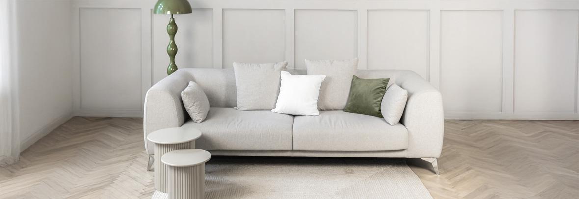
Neutral Paint Trends Guiding 2026 Staging
From warm neutrals to muted greens, paint trends support staging strategies that create broad appeal without overpowering a space.
NEW YORK — If you're searching for a new hue this new year, look no further than your local paint or home improvement store. Manufacturers large and small offered up their annual "Color of the Year" – in some cases, multiple colors of the year – designed to help you refresh your space in 2026.
Whether used in all-or-nothing color drenching or in small doses for pops of color, paint is one of the top ways to personalize a space. Here all of the latest offerings to help you color your world:
A fashion-forward classic
Paint manufacturers opted for bold choices. Benjamin Moore announced Silhouette – "an alluring mix of rich espresso hues with subtle notes of charcoal" – as its 2026 Color of the Year. According to a news release, the company drew on inspiration from the couture and classical suiting.
"The connection between fashion and interiors has always been a source of inspiration, but this year in particular, we've noticed a renewed interest in suiting and classical silhouettes; the resurgence of timeless pieces; and the growing interest in the brown color family," says Andrea Magno, director of color marketing and design. "Silhouette embodies these qualities with its depth and luxurious blend of burnt umber and delicate charcoal undertones. "
Along with the Color of the Year, the company also announced seven other colors that make their Color Trends 2026 palette that "reflects a graceful balance of enchanting pales and handsome midtones."
Pantone's 'blank canvas'
In December, global leader Pantone announced Cloud Dancer, an airy white, as its Color of the Year for 2026.
"The cacophony that surrounds us has become overwhelming, making it harder to hear the voices of our inner selves," says Pantone executive director Leatrice Eiseman of the choice. "A conscious statement of simplification, Cloud Dancer enhances our focus, providing release from the distraction of external influences."
As part of Pantone's announcement, the company partnered with others to interpret the color, including Motorola, Play-Doh, Post-it, Command, Pura home fragrance and furniture maker Joybird. While not everyone was a fan, Better Homes & Gardens called the shade "a calming, inspiring neutral that feels positively celestial," and one that has staying power.
Functional red
Glidden, part of Pittsburgh Paints, chose Warm Mahogany, "a rich, warm-toned and timeless red… with a heritage that's reimagined to adapt to the purpose and mood of any space," according to a news release, which also claims the color is "a trend for anti-trendseekers." "Highly adaptable, the 2026 Color of the Year takes the role of main character or supporting star in spaces that crave connection, rest and play. With qualities that are quiet and loud, traditional modern, playful and resilient, introverted and extroverted, Warm Mahogany encourages DIYers to embrace juxtaposition and lean into a color that is as functional as it is fashionable," the company says.
Quiet confidence
Taking the middle ground, Sherwin-Williams and HGTV Home by Sherwin-Williams unveiled Universal Khaki, their first unified 2026 Color of the Year.
"Khaki is more than just a neutral – it's a timeless, go-anywhere shade that brings a sense of grounded elegance to any space," notes Sue Wadden, director of color marketing. "With its warm, earthy undertones," the color "effortlessly complements a wide range of colors, creating a rich, inviting backdrop that can transform an entire design with quiet confidence."
In conjunction with the choice, HGTV Home by Sherwin-Williams announced its 2026 Color Collection, 10 curated hues that draw inspiration from nature. "The Honest Essentials is a reflection of consumer design for clean lines, minimalist décor and a more intentional approach to design and life," according to Ashley Banbury, color marketing manager.
Serene green
Green continues to be a top choice. Valspar, available at Lowe's, chose Warm Eucalyptus as its Color of the Year for 2026. It's "more than just a beautiful shade of green, it's a reflection of the comfort we crave in our homes," says Sue Kim, director of color marketing. "Its warm undertones create a grounded, welcoming mood while drawing inspiration from nature and the familiarity of retro design. This is a color that encourages restoration and resilience."
Behr, available at Home Depot, also chose a green hue with Hidden Gem, a sophisticated blue/green that moves away from the more organic olive shades popular in past years. The color is part of the line's 2026 Trend Palette, which includes a range of colors designed to work together and make picking paint painless.
Dunn-Edwards also chose a moody and mossy green, Midnight Garden, as its color of the year, while California Paints leaned toward a more olive medium green with Cactus Valley.
Other picks
Dutch Boy picked Melodious Ivory, a creamy white designed to complement a variety of styles. The tone 'invites homeowners to embrace what matters most – comfort quality and connection," explains a news release, and "offers a classic backdrop that beautifully supports the textures, elements and personal touches that make a space truly feel like home."
James Hardie opted for Iron Gray, a bold charcoal hue the building products company says works equally well in modern and traditional homes and highlights exterior features.
"Color has the power to amplify a home's architectural voice," explains Samara Toole, chief marketing officer. "We wanted a color that is expressive, yet grounded, one that complements strong lines and invites highlight trims to pop."
Copyright © 2026 democratherald.com. All rights reserved.
